Paper crafting is works of heart

Paper crafting is works of heart!
Showing posts with label CTD. Show all posts

Wednesday, July 25, 2018

Four Challenges fused into one card

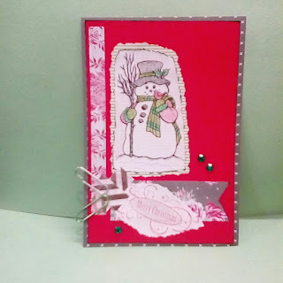
Let's see if I can stretch a trifecta of challenges to a quartet combined into one card:


Short summary: (1) use of title (Merry Christmas); (2) use Christmas theme (title & snowman); (3) use colors of red, green, and grey; and (4) use sketch (same orientation, just substituted flowers for snowman, metallic striped tapes, and clips; and I didn't use the thin strip all the way to the bottom).


Challenge #1: 2nd entry [theme is optional as long as I use a title/sentiment message]
http://useyourstuff.blogspot.com/2018/07/challenge-322-anything-goes-with-title_23.html


Challenge #2: 2nd entry [Christmas theme]

http://12monthsofchristmaslinkup.blogspot.com/2018/07/challenge-43-anything-goes.html


Challenge #3: 2nd entry [color palette]
https://colorthrowdown.blogspot.com/2018/07/color-throwdown-503.html


Challenge #4: 1st entry [sketch layout]
http://papercraftcrew.com/pcc300-sketch-challenge/


More photos:


All the patterned cardstocks and striped patterned paper are from The Paper Studio (Hobby Lobby). The red cardstock is the Astrobrights line from Neenah Papers, Inc. Image is clip art or coloring book freebie found during an online search last Christmas and I had 2 remaining, so now I'm left with one. Merry Christmas was stamped on white paper with red ink and then a grey colored pencil was used to lightly fill color around the lettering and offer a bit of depth. I love the juxtaposition of 2 flowery printed cardstocks for this Christmas theme card! It adds some whimsical charm. Overall dimensions are just over 4" x 6".

Still crafting in the USA heartland, Becca S

PPCC blog 390 for 25 july 2018

Another adorable digital image to feature:


PPCC blog's #390 challenge theme is anything goes. Prize sponsors plus provider of images for the Design Team are: Just Me Digital Stamps and Oddball Art Stamps. My image from JMDS is labeled "wonderful wizard" and this is just 1 image in the set. [I made the reverse image from tracing/flipping/twice. The original features chalkboard to the right side.] 
Go to the PPCC blog post to see all the images provided to the DT this week. While there (or here on my post) use the sponsors' links to visit their online stores to check out what else they sell. 


Prize sponsor/DT image provider for PPCC #390 Link: https://www.etsy.com/uk/shop/JustMEdigitalstamps


A 2nd prize sponsor/DT image provider for PPCC #390 Link:https://www.oddballartco.com/ 


The background cardstock is cream however the lighting and/or cell phone camera make it appear pinkish. (sorry) More views of this card:


And another challenge link-up as a participant (rather than DT):

http://12monthsofchristmaslinkup.blogspot.com/2018/07/challenge-43-anything-goes.html


Also a third challenge link-up and 2nd as a participant:


And then there is a fourth challenge link-up and 3rd as a participant using red, green, and gray (top chalkboard frame is gray and both boys' glass lenses are gray; green gems and various greens for chalkboards and scarves; and various red hues in base cardstock, background matting paper, snowflake print doily, images): 


I did the cursive lettering for Merry + Christmas since this digital image in the set had empty board. The other images have a happy birthday board, no board, and other options. 

Still crafting in the USA heartland, Becca S

Friday, July 13, 2018

Bookmarks with color palette for CTD 501 and IB 28

What colors remind you of nature? meadows? woods? hills and mountains?


These challenges started at different times this week have been the sources of motivation for creating 2 bookmarks. A school district near us has the mascot Timberwolves and colors of dark green, gray, and black. So I decided this evening to fuse the color combos together a bit:


Inspired By #28 Campfire S'mores (colors: kraft, white, dark brown/black, and green from the boxes)
Color Throwdown #501 colors (grey, yellow, kraft, and white)


http://theseinspiredchallenges.blogspot.com/2018/07/inspired-by-campfire-smores.html


and


https://colorthrowdown.blogspot.com/2018/07/color-throwdown-501.html

Here's my shopped supplies from my stockpiles to get ready. You will notice some editing has been done. Until I've played around with combinations and sizes, several changes can occur while in the process of making paper crafted creations. Digital images have had several layers of colored pencils (black, gray, dark brown, light brown) added to them to make them match the color palettes better. Placement of elements is different between the two. Thinking of you border is different on each bookmark as well as what was used as the base and what was used for the background.


#1: CTD 501


#2: IB 28


Supply sources:
a. damask paper used for a backdrop and the dotted papers are= The Paper Studio
b. dark pine green and medium gray cardstock= The Paper Studio
c. marbled caramel thin weight cardstock and putty gray cardstock=Colorbok
d. kraft cardstock=?
e. Thinking of You stamp= Stampin' Up (bought used/resale shop)

Continuing to craft in the USA heartland, Becca S

Tuesday, June 26, 2018

PCC296 and AIM23 and CTD498 combined card for anniversary

another happy #24 anniversary card

another card featuring flamingos:


Some design notes:
a. foam square adhesives are behind the flamingos to lift them off the patterned paper also featuring flamingos (The Paper Studio)
b. mixed media elements: ribbon, arrow paper clip, stamping, digital image, colored penciling, staples, stenciling, inking/weathering effect


Yes!, 24 years from mid-July I served as a bridesmaid in back to back weekends. The dresses were sewn from very similar patterns yet different fabrics and wedding themes. The first one was in eastern Missouri for a very good friend who 1 1/2 years later was one of my bridesmaids. And the second wedding was in eastern Illinois for my brother. He and his wife were a groomsman and a bridesmaid as well when it was my turn. Not sure which couple will get this card but I'm about three weeks early on creating both flamingo anniversary cards, which is a big deal. Now, hopefully I won't forget to mail in 2 weeks or so!!!


Sketch inspiration was turned to the right for a vertical placement (just like in the previous blog post). Flamingo image is representing the square box from the sketch. The sentiment is split between the upper right corner and right side. The dots on the sketch were already included on the background paper, so the heart/ribbon/clip are angled in about the same direction as the sketch dots.

Blog post link for PCC296= 


AIM's no 23 challenge month started on June 25th. This will be my 3rd card that I've entered for the mixed media theme blog.
Blog post link for AIM23= 


I missed the deadline to include my 2 flamingo inspired anniversary cards, however the color palette of #498 was the motivation for the hues and selections of designer papers and cardstocks.
Here's the blog post link for CTD 498=


I also am in love with this card and especially the little added scene effects I filled in. Doesn't it look like an evening sunset is behind these love birds?!!!

Still crafting in the USA heartland, Becca S

PCC296 sketch challenge and color inspiration from CTD challenge blog

Happy Anniversary #24

Flamingo coloring book image was printed to a 3" x 5" size and then filled with various hues and drawing enhancement to create a little marshy scene around the feet of the flamingos:


The motivating sketch was turned to the right for a vertical placement. The flamingos represent the boxed focal shape, the hearts represent the flower and leaves, #24 is the sentiment, and 4 pearl dots are used instead of 5 as shown on the sketch.

Link: https://papercraftcrew.com/
https://papercraftcrew.com/pcc296-sketch-guest-designer/


The majority of the colors follow this color palette for CTD 498. I missed the deadline posting but will share the link in case anyone wants to check out the on time submissions and/or the design team creations.

Link: https://colorthrowdown.blogspot.com/2018/06/color-throwdown-498.html


I just love how this anniversary card turned out! The colors coordinate fabulously! 

Design notes:
a. white with pink polka dots paper= The Paper Studio
b. bright pink with white polka dots and citrine (yellow-green) with white dots papers = Colorbok
c. plaid paper is very old stock (8+ years in my stash)
d. pale pink cardstock = Colorbok
e. coloring book image of flamingos was found online; lots of different hues of blue, green, pink, orange, and yellow were used and then a dark olive green marker was used to create a border around the image to distinguish it from the plaid paper background

Stay tuned for another card created with these two blog challenges plus a third blog all combined in the next post,

Still crafting in the USA heartland, Becca S

Monday, April 2, 2018

CTD 486 blush and pink and peach along with AHB 4 challenges

HB...happy birthday...


Love

playing along with 2 challenges today:


(1) CTD or Color Throwdown #486 using blush, pink, and peach color combo


CTD's badge


(2)
AHB 4 or Always Happy Birthday...month 4...April's anything goes birthday with option of balloons (for this 1st link up I've chosen not to do the balloons)


badge

and the main card area's layout is based on this sketch:


Notes:
a. the sketch image shown above was shared in the Facebook group "100 Pattern Papers"
b. I altered the card in width; used stenciled crowns in place of the top rows of scallops; used flamingo pattern paper in place of the gray horizontal section with cording added; used graph grid index card with stenciled "hb" in place of black horizontal section and sentiment ribbon; used a stenciled birthday cake instead of the flower and with the size dropped below I opted to not use any of the ribbon tail sections on the bottom third
c. pink with white dots pattern paper is from Colorbok
d. flamingo pattern and light peach striped pattern designer papers are from The Paper Studio
e. different values of pink and peach/orange were used to help meet the required color combo for CTD 486
f. overall I like the quirky fresh light feel of this birthday card! winner winner flamingo dinner! Ha-ha!!


Saturday, March 17, 2018

HIMCR 344 tic tac toe challenge and PCC blog card sketch 284

Hoppy Easter

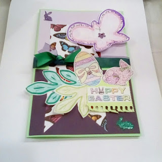
technically version 2 for the HIMCR challenge 344 using animals, flowers, glitter, and stripes (used a postage stamp corner like for bingo and the glitter is not only in the flower stick-ons but also used as glitter crayons for the 2 digital images from The Cutting Café, sponsor at HIMCR)


getting started, but by the time I finished I didn't use the mesh-style gems or the purple flower center...editing works most of the time!


another case of editing/moving things around; from when I photographed this and as I decided how to use the images, I needed to move the flower stack to the other side of the card

 HIMCR's badge and link for post: http://www.hidinginmycraftroom.com/2018/03/himcr-344-tic-tac-toe.html


HIMCR's sponsor for #344 challenge is The Cutting Café, I've used the egg and bunny pair with the Easter Wishes sentiment for the front panel and I will use the stacked "Hoppy Easter" for the inside.


I was also inspired for this spring and Easter 2018 card creation with using Paper Craft Crew's 284 card sketch:
(link for their post: http://papercraftcrew.com/pcc284-sketch-challenge/ )

I've reversed placement for the flowers and the tag/bookmarks and changed the ratios for the background papers. I also used cording instead of leafy branches for this card version.

And if you have been reading the fine print, the card shown at the top of the post was the 2nd one made for the HIMCR #344 challenge. For the first one, I needed to edit a lot, I think, after I made it. It has a lot going on. I tried to use the above sketch and combine it with another one that was posted this week for a Facebook group called 100 Pattern Papers (shown below). And I also was using the color palette from CTD #484 (Color Throw Down) of green, violet, and white:


In version 1 from the HIMCR tic-tac-toe challenge (use the link to see the grid choices and get more details and rules for participating), I used ribbon, glitter, and blending (washable markers used on edge of butterflies). In my mind's eye, the card is okay, it's just very busy with proportions being off and too many elements.

When I snapped the photo of the base and backgrounds for the version 1, I was so excited about the potential:


(link for CTD 484: http://colorthrowdown.blogspot.com/2018/03/color-throwdown-484.html )

Note on technique: I cut a slit in the fold about midway on the left fold to hold the ribbons.

Maybe between today/Saturday and Monday I will try again with this color combo and one of the sketches. I still have some butterfly designer paper left (The Paper Studio by Hobby Lobby).

I've got more photos that I've sent from my cell phone but having a data usage problem I think since it is a cheap pay-as-you-go type and only had 3 pics come through and others waiting in queue...ugh. So I will either add those in a day or two or create a 2nd/part two post on a future day. Until then, Becca